Support #279
closedForm placeholders look like real entered text: use a lighter colour so they can be told apart
0%
Description
On several forms, the example (placeholder) text is as dark as text the user has entered. This makes it hard to see which fields are still empty, and a field with a placeholder can look as if it is already filled in. Placeholders should be clearly lighter than real values.
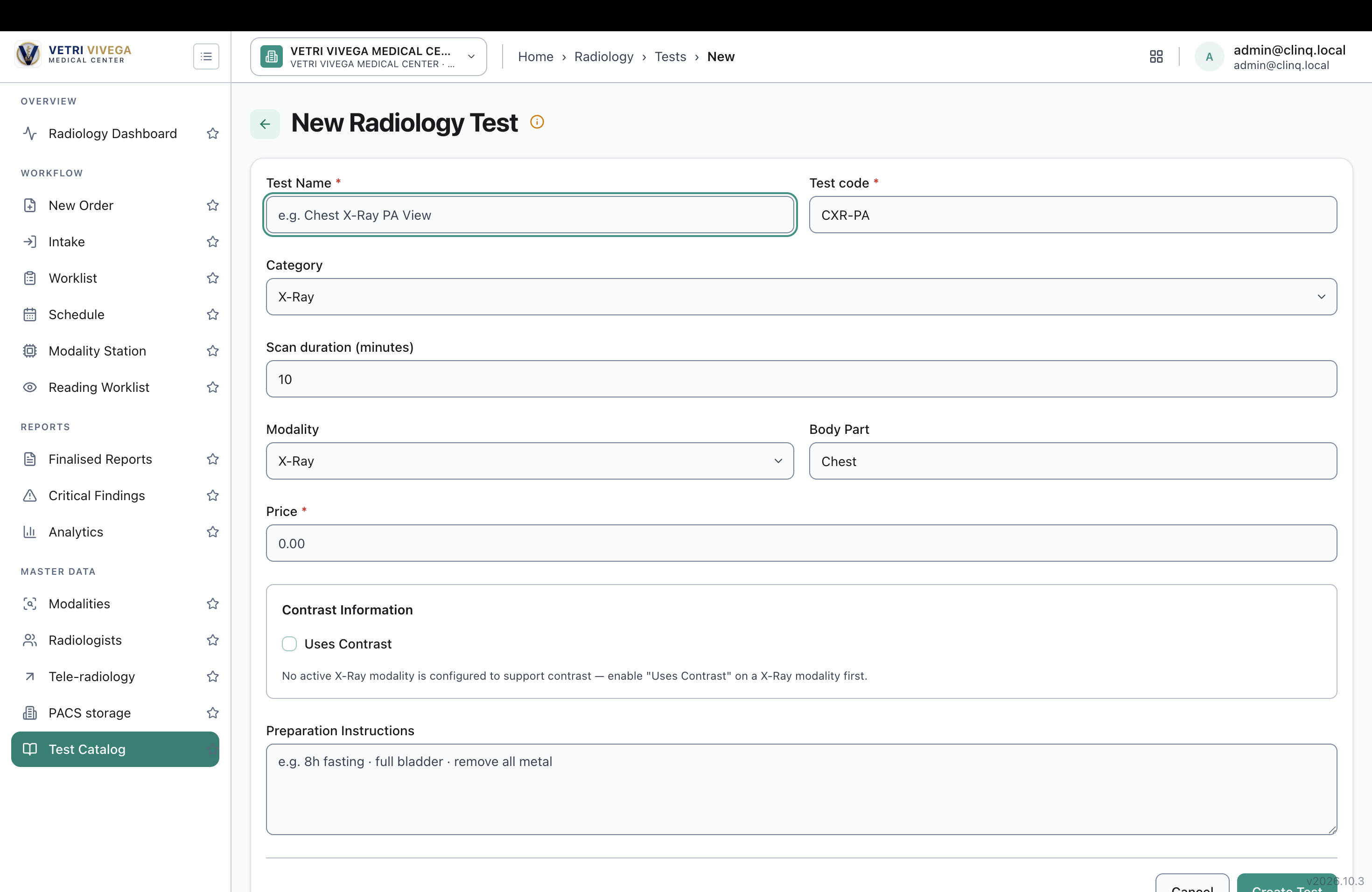
Example screen: Radiology → Test Catalog → New Radiology Test. Placeholders such as "CXR-PA", "Chest" and "0.00" look the same as typed values, while other placeholders on the same form (for example "e.g. Chest X-Ray PA View") are lighter.
Environment: https://vvmc.test.clinq.health (Vetri Vivega Medical Center, test tenant), build v2026.10.3 Module: Radiology → Test Catalog → New Test (and other forms; the request is for the whole app) Logged in as: admin@clinq.local Requested by: Roshni Harish (roshni.h@expericia.com) Date: 7 Oct 2026
Steps to reproduce
Open Radiology → Test Catalog and click New Test.
Look at the empty fields: Test code, Body Part, Price and the others.
Compare them with the Test Name placeholder and the selected values in the dropdowns (Category, Modality).
Expected result
Placeholders use one light grey colour across the whole app, clearly lighter than entered text, but still readable (enough contrast). Real values and defaults are shown in the normal dark text.
Actual result
Several placeholders ("CXR-PA", "Chest", "0.00") are dark and look like entered text. Others on the same form are light grey, so the form looks inconsistent. It is not obvious whether the user needs to fill those fields.
Not checked
Whether "CXR-PA", "Chest", "0.00" and "10" are placeholders or real default values. If they are real defaults, the user may save them by mistake, and they should be marked as defaults or left empty.
Other forms in the app. The report asks for a check of all of them.
Why it matters
Staff can skip required fields thinking they're filled, or leave example values in by mistake. It also makes forms harder to scan.
Suggested fix
Set one shared placeholder style (a lighter grey, for example) for all inputs, text areas and search boxes.
Keep the contrast readable, and use a clearly different colour from the value text.
Replace example values like "0.00" or "Chest" with real placeholders or leave the field empty if no default is intended.
Priority
Low. A visual issue, but it affects every form and can cause entry mistakes.
Files
AV Updated by Alminta V. about 1 month ago
- Due date set to 10/07/2026
- Status changed from New to Resolved
- Assignee changed from Alminta V. to Roshni Harish.
- Resolved By set to Alminta V.
AV Updated by Alminta V. about 1 month ago
- Due date changed from 10/07/2026 to 10/08/2026
RH Updated by Roshni Harish. 25 days ago
- Status changed from Resolved to Closed